Sometimes a project gets away from me (usually in a good way). In this case, a gift for a friend somehow morphed into a mini-photoessay.
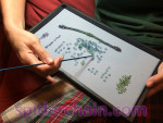 This is where it all started… I was making a birthday present for a dear friend – my husband thought that the niobium color fade looked pretty, so he snapped a picture with his iPhone. In this picture I’m working out the tricky “middle bit” of the color fade. The grey backing is a velvet display board set into a display tray. These trays are super-useful for organizing projects. I bought mine from Rio Grande, but they’re available from lots of suppliers. The black plastic tray has little feet that allow you to stack several of them securely. The grey velvet work surface is only one option out of many possible inserts. I use velvet inserts for scooting rings around to make color fades, and inserts with compartments for keeping track of multiple sizes of rings.
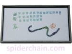 Mr Spider’s picture was pretty, so I took another one after I’d gotten my color units sorted out and was a little further into the necklace. The niobium rings are clumped into groups of four, each destined to make one “cage” of the Birdcage chain. This level of micro-managing isn’t necessary for every project, but it was quite convenient for this one. Get all the thinking out of the way at the beginning – then just settle in and weave!
I did outsmart myself a bit when it came to the overall pattern. My friend wanted a 20-inch necklace, and I decided to make five “segments” to the piece, meaning that each segment was four inches long. So far so good… but an odd number of segments meant that my color fade units wouldn’t meet correctly. I “cheated” by compressing the last segment into two mini-fades, meeting at the clasp.
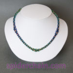 And then I remembered I’d gotten a new display bust that I wanted to test in front of the camera. I know just the piece to use! I’m not convinced about the white-bust-grey-background setup. I’ll probably go back to grey-bust-white-background. It’s always so interesting to see how the camera translates objects into images. The results of product photography are sometimes surprising.
I like how this necklace came out. It’s not a complicated chain, but the slow-repeat color fade and the subtle size graduations add a bit of illusion and double-take appeal.
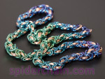 The on-bust picture didn’t really capture the colors, so it was time to break out the matte black plastic and try for an artful squiggle. Have I mentioned recently how much I love niobium? So pretty!
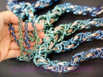 Here I’m “tweaking” the above image in Photoshop, trying to get it closer to the colors of the real necklace. On the subject of computer screens and color… If you’re serious about your images, it’s very much worth getting a calibration system for your computer screen. You can’t control how other people’s screens are set, but if your images start out with accurate colors, you have a better chance of your viewers seeing something reasonable.
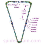 By this point I knew I’d be posting pictures, and someone would want to know the details of ring sizes. Voila! One map!
I like to record my pieces this way. Project maps make it so much easier to remember how I made a particular piece, and also much easier to communicate the design to someone else. (The maps that are just for my records aren’t usually this pretty!) I post these images on the project maps page, which is a repository for fun designs that don’t need a whole lot of explanation, just a bit of guidance on which sizes to use.
I encourage you to document your own work. Take a picture, make a sketch, and then label the sizes that you used. Very handy later!
Leave a Reply